This week, we started to focus on one of our extra tasks. The ones we chose to do was a radio advert and poster, with us choosing to this week look at posters. Before planning what our poster will look like we decided to look at other posters from a similar genre (psychological thriller) so we can see the conventions used and discuss how we could use them in our own poster.
1) The Happening

This is the first poster we looked at and we both thought it was very effective. We liked the dark colour scheme and the low key lighting used as we thought that it made the image seem mysterious. Also the mise-en-scene makes the city looks like a ghost town, with the distorted walls closing in on the three people in the centre. From this poster we thought the most useful aspects to use in our own was the colour scheme and lighting. This is because both of these aspect give off a scary vibe and makes the people in the image look helpless which is what we want to go for with our own poster.
2) Waz

In this poster we liked the close up on the face and emphasis on the eyes as it cleary shows what the person is feeling. We also liked the font used for the title as it looked scratched in giving off a desperate and frightened vibe, one which refects Lucy's character. After looking at this poster and many others we also think it would be a good idea to have a tagline, as they draw the audience in and gives a sense of mystery.
3) Murderer

Dispite this being a foreign film we bth really liked this poster. Like in poster two is shows a close up on the face which we think is a very effective idea as it can portray a range of different emotions, making it a useful tool for many genres. Like in the the other two posters this poster also used low key light. We like this aspect because it gives and air of mystery and fear which would be useful in our own poster. WE are going to use dark colours and low key lighting to, in our case, give off a scared vibe.
From these three posters we have gained many ideas for our poster including the lighting, mise-en-scene and composition of the shot, for example, low key lighting gives off a sense of mystery which in our case would be concerning wheather or not Lucas is real.


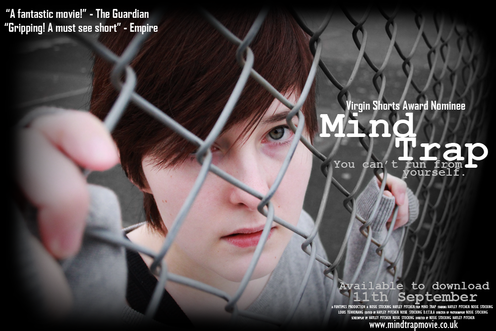
 The quality of the photo is, of course, better when the image isn't shrunk down. But we chose this picture because we like the high angle we used, as it made the character seem more vunerable. Also the way the character is gripping onto the fence makes it seem like she is "trapped" which relates to the title. Finally, due to the initial gloom of the picture, it will be easier to edit to look darker.
